posted by ![[personal profile]](https://www.dreamwidth.org/img/silk/identity/user.png) oltha_heri at 09:27pm on 10/12/2008 under icons &c., icons &c. us tv: battlestar galactica, icons &c. us tv: farscape
oltha_heri at 09:27pm on 10/12/2008 under icons &c., icons &c. us tv: battlestar galactica, icons &c. us tv: farscape
The second part of the Sci-Fi Miniseries' of Awesome post.
Battlestar Galactica
44 icons; from part 2 of The Miniseries
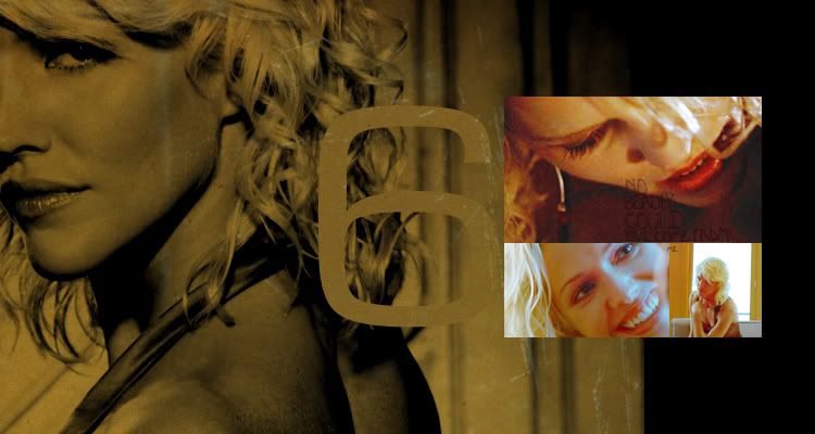
1 banner; six
Farscape
36 icons; from part 2 of The Peacekeeper Wars
1 wallpaper; john & aeryn
teasers;


Battlestar Galactica
44 icons; from part 2 of The Miniseries
1 banner; six
Farscape
36 icons; from part 2 of The Peacekeeper Wars
1 wallpaper; john & aeryn
teasers;
| Farscape |
| 44 icons & 1 six banner (part 2 of The Miniseries) |
| 1 | 2 | 3 |
 |
 |
 |
| 4 | 5 | 6 |
 |
 |
 |
| 7 | 8 | 9 |
 |
 |
 |
| 10 | 11 | 12 |
 |
 |
 |
| 13 | 14 | 15 |
 |
 |
 |
| 16 | 17 | 18 |
 |
 |
 |
| 19 | 20 | 21 |
 |
 |
 |
| 22 | 23 | 24 |
 |
 |
 |
| 25 | 26 | 27 |
 |
 |
 |
| 28 | 29 | 30 |
 |
 |
 |
| 31 | 32 | 33 |
 |
 |
 |
| 34 | 35 | 36 |
 |
|
 |
| 37 | 38 | 39 |
 |
 |
 |
| 40 | 41 | 42 |
 |
 |
|
| 43 | 44 | |
 |
 |
| 45 (banner 750 x 400) |
 |
| Farscape |
| 36 icons & 1 j/a wallpaper (The Peacekeeper Wars part2) |
| 46 | 47 | 48 |
 |
 |
 |
| 49 | 50 | 51 |
 |
 |
 |
| 52 | 53 | 54 |
 |
 |
 |
| 55 | 56 | 57 |
|
 |
 |
| 58 | 59 | 60 |
 |
 |
 |
| 61 | 62 | 63 |
 |
 |
 |
| 64 | 65 | 66 |
 |
 |
 |
| 67 | 68 | 69 |
 |
 |
 |
| 70 | 71 | 72 |
 |
 |
 |
| 73 | 74 | 75 |
 |
 |
 |
| 76 | 77 | 78 |
 |
 |
 |
| 79 | 80 | 81 |
 |
 |
 |
| 82 (desktop 1280 x 800) |
 |
do not steal i.e. credit ![[livejournal.com profile]](https://www.dreamwidth.org/img/external/lj-userinfo.gif) oltha_heri
oltha_heri
do not hotlink
a textless icon is not a base
all comments are loved
resources
do not hotlink
a textless icon is not a base
all comments are loved
resources
(no subject)
(no subject)
(no subject)
(no subject)
(no subject)
(no subject)
(no subject)
(no subject)
(no subject)
(no subject)
(no subject)
(no subject)
(no subject)
(no subject)
(no subject)
(no subject)
(no subject)
(no subject)
BSG! 1. Perfect use of a diffusion texture and I LOVE the text composition! What font is that? 2. Gaeta...cool name. 3. Could have been erased a little better but I love the background texture, unusual usage. 4. SO GOOD. Love how she's fadey, makes it arresting, nice font choice too, that's difficult with comps like this. 5. Too crackly/grainy, but nice image. 6. Hottie? Nice coloring, pity the caps' grainy, but actually I don't even care, the image and image crop are powerful enough. 7 Ooh colour, damn graininess! 8. Grainy, but nice emotive cap. 9. TEXT CHOICE good! Love how she fades out too, very siniester looking. 10. Too red and grainy, hate it when one gets stuck with something like that, SO frickin' hard to fix! 11. I love this!!! I love the crop of the image in the polaroid frame---sooo reflective and awesome even I want to know more about her and I dont watch BSG. DONT SPOIL ME BTW. 12. OH omg i love icons like this and your erase between them is just gentle enough that it's really been pulled off food. Nice colour too. Did you just use the eraser tool? 13. LOVE IT. I think the blurry erasure of her background works becuse you chose a light diffused/blurry background so it just looks like she's sitting in a place with a lot of strange interstellar light. 14. SO GOOD. This was my favorite on my first zip through, love the font choice (which font? i doubt i could use it as well) and love the crop that shows her lips and the tangle of her hair and the white background with the indents that look like '4' and juxtapose so well. Really really good, love the dramatic feeling! 15. Less effective than 13 because you can see the blurry erase job, but the idea is sweet. 16. Too grainy. 17. Bleh same, caps are such hard buggers to work with. 18. whoa creepy looking but love the fullness of the lips and the red around the eyes and the lined text. 19. hottie? love the text use and this is a fantats erase job! 20. GOOD use of text and light diffusion textue, but i can still see the graininess. 21. LOVE WHAT THE TEXT SAYS BUT IT MAKES ME WANT TO GO BUCCANEERING WITH ELIZABETH SWANN AND STAND NEXT TO A PIRATE KING ON THE ENDLESS DEEPS OF THE BRIGHT BLUE STORM TOSSED PIRATE RULED SEA!!!!!!!! AND I WILL. 22. Picard?! Whoa, no, but close. NICE use of dramatic crop with dramatic text, and good colouring! Balances the speckly cap really well. 23, ahhh colour so yummy. 24. DEAN WINCHESTER?! Oh wait no, some other hottie, sorry, woops, awesome cap and looks way more hq than past few, good management there. 25. again with the cut-couple icons i absolutely FUCKING LOVE. Again, just the eraser tool? I love this icon, the colouring is so good it hurts and the mischeivousness of the two works well even though the scale is a bit thrown. 26. nice scale usage and texture overlay, again with the shitty caps, may i beat them for you? 27. THAT is excellent composition!!!!!! did you use a texture here? the rainbowy-background looks AMAZING. And the shadows you got out of her face, so good! 28. COLOUR COMP COLOUR COMP COLOUR COMP this one is just about fucking perfect! 29. I like this one too, what font is this i must need it now?!?!?! more graininess visible but meh handsome icon nonetheless. 30. She looks poppin' with the blue red and yellow-white you got out of her, nice cross-black too and the text is good, arresting icon eminantly usable! 31. LOVE THIS COMP. I may have to imitate it. Again watch the erasing...her shoulder's got white on it. 32. fucking brilliant, love the texture you used and the red colouring works so hot in contrast to the blue and the clarity of the image, you maintained it. 33. This is my second favorite, easily. Love the HQ look, the diffusion texture (so good!), and the absolutely stunning, terrifying,
(no subject)
six bannr...STUNNING AS FRELL. LOOVVVVVE the 30s movie star coloring she gets, contrasted with her evilicious bright reds, yellows, and space blues in the insets. HOT AS SHITE. Did you put that 6 in or was it in situ in the base image? HOT.
(no subject)
(no subject)
Standard Ariel, I believe.
9.
I'm so glad you like the font choice as I had like 15 different things go on and I just didn't know which one to pick, but also knew I couldn't leave it blank.
12. Did you just use the eraser tool?
No, no eraser tool. For the blend between the images I used a gradient on a mask, and for the black at the bottom (and the darkness of the icon) I used a texture.
14. What font?
I don't know. I think something like Lucida Grande, one of the Lucida I'm pretty sure. (I lost all of my donwloaded fonts a while ago and I've been too lazy to replace any of them so I've been using very basic stuff.)
16. Too Grainy.
I KNOW. I hated this icon, I didn't even mean to upload it, but if I didn't then all of the numbers would've been screwed up, and argh, I really dislike it.
20. I can still see the graniness
I know, WTF, it was fifteen times worse on all of the Lee or Roslin caps, WTF.
MAKES ME WANT TO GO BUCCANEERING WITH ELIZABETH SWANN AND STAND NEXT TO A PIRATE KING ON THE ENDLESS DEEPS OF THE BRIGHT BLUE STORM TOSSED PIRATE RULED SEA!!!!!!!! AND I WILL.
*pets* Of course you will. *nods
condescendinglyknowingly*Cut icons 25&26: Just select tool, no blurring nothing just cropping them to 100x50.
25, scale being thrown:
I know the scale is off, but she thought he was dead and it was kind of our first definitive proof that Kara Thrace loves Lee Adama, so I had to do it.
may i beat them for you
please.
27. did you use a texture here?
Yes, a light texture, I had fun playing with them, I don't usually use them.
28
I am so in love with this icon, partially because her expression is part of the reason I want to have her babies.
29-all: what font.
ariel.
Banner
I put the six in.
I can't wait for you to get to farscape. I am really proud of this post partially because I feel like my last few posts were lacking. I felt like I was just being icon factory instead of icon maker. That's why I fooled around with textures and erasing so much.
(no subject)
Oh God I know EXACTLY how you feel. Like I can keep doing the same shit or I can really push myself to be BETTER and CREATIVE like I used to be, you know? So I've been dling textures like crazy and trying to do all kinds of new things, many of which are going to be ugly at first but I am still completely satisfied with them because they are the beginning of further artistic evolution and I can deal with the in-between stages happily!
YOU PUT THE 6 IN? It seriously looks professional. I'm kind of super tired now so I will probably do Farscape tomorrow. Oh and I know you will hate me but I have to say I HATE Kara's haircut, with such a passion, I just, I just can't, oh no, never, urgh, hate. LOL though I totally feel like I am following this show, not by watching it, but by looking at your icon posts!
(no subject)
(no subject)
(no subject)
(no subject)
Lovely icons. :)